Perfect Website Navigation: Tips for Getting the Best Possible User Experience
Good website navigation is like good film music. When it achieves its purpose, you don’t think about the individual elements; instead, the overall experience is totally pleasant. To make your navigation really great, we’re going to tell you about why good menu navigation is based on the expectations of your users, why it’s the worst possible place for creativity, and what best practices have become established in various navigation elements.
Website Navigation: When People Have to Search, They Disappear
The worst-case scenario: Your customer has to actively search for information or gets lost on your website. The problem: Potential customers always find ways, namely away from your page. So every click on your page has to be completely intuitive. The user will click several times as long as they don’t have to think about it. A customer journey at an online retailer often looks like this: Homepage> Clothing> Women> Shoes> Loafers> Black. The customer only stays longer on the last page. In most cases, she no longer knows how many clicks she went through to get there.
Less Navigation Means More Conversions
Anyone who loves their website and has put a lot of heart and soul into it wants to show their users every single page. But this isn’t the job of a navigation bar, it’s the sitemaps job. Concentrate on the essentials in the navigation bar so the user can see your offers at a glance. Here’s a rule of thumb: No more than seven items should be displayed per level. The first link in the menu always leads back to the start page, and underneath you place the most important categories of the page. Incidentally, Amazon and Otto deliberately do things differently with their gigantic dropdowns to show how extensive their portfolio is. Experience has shown that users almost exclusively use the search field with such a large assortment, which is why the shipping giants can afford to use such confusing navigation.
By the way: The weakest position in the menu is not at the end, but in the middle. That’s why you should always place high-conversion categories at the edge.
Learned User Behaviour When Navigating
Experience shows that intuitive elements are characterised by the fact that they make use of the user’s learned behaviour. We automatically look for a login field at the top right. The return to the start page is at the top left. And we send forms at the bottom right. Meet your customer’s expectations so that they can move around on your site without resistance. Here are a few specific examples of these expectations:
The Right Place for the Navigation Menu
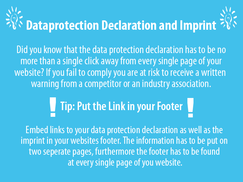
The best place for your navigation menu depends on what type of site you’re running. In large online shops and news portals, it’s usually at the top, in sites with manageable offers or services it tends to be on the left, while blogs mostly have the navigation on the right-hand. By the way, the navigation bar should never be at the bottom of the page. The users look for information about your locations, the company philosophy or job advertisements there. This is also the right place for the mandatory information that every website operator has to provide, such as the address, the legal notice and the data protection declaration. Do not mix this information into the navigation element. It will distract users you want to convert while confusing users who are looking for the mandatory information.

The Navigation Always Looks the Same
Creativity is often required in web design, but not in navigation. Good navigation is like a map for the user. It tells them where they are at the moment and gives them the assurance that they can always get back to where they started - without having to use the browser’s back function. Make sure the element is in the same place and has the same design on each page. Changing things up in favour of a different layout on one page won’t compensate for the visitors you loose.
The Navigation Should Be Clear
Navigation that consists solely of icons certainly looks nice, but requires a lot of associative skills from the user. It’s better to use these to illustrate the text. For example, you can use a house icon next to the word “Home”. Also use the language of your target group. If it consists primarily of Silver Surfers (users over 50 years of age), don’t, for example, make the navigation bar in English if the audience is German. Always choose the phrase that is clearest, for example “Contact” instead of “How to contact us”.
Navigation Should Be Optimised for Mobile Use
Your navigation should be displayed on mobile devices flexibly and be easily readable and without scrolling. Comprehensive menus can best be displayed then by expanding and collapsing them. It should always be clear whether you are in the expanded or collapsed area. This not only improves the user’s experience, but in the best case can even improve your Google ranking. The search engine giant has preferred sites with good mobile optimisation for some time.
Don’t Worry about Legal Warnings with exali Professional Indemnity Insurance
Even the most attentive maintenance of your own website will not protect you 100 percent against legal warnings and claims for damages. Be it because of a violation of the Price Indication Ordinance, a lack of information in the legal notice or an infringement of image rights, with Professional Indemnity Insurance from exali, your online risks in the context of your professional activity are comprehensively covered. You can get insured in just five minutes thanks to the intuitive online calculator.
If you have any questions about the right insurance coverage for your website, please don’t hesitate to contact our customer advisors. You can reach them without going through a call center or waiting in a queue.
Calculate your premium and get your professional liability insurance online in just a few steps here:

Content-Manager
With over 10 years of professional experience in online marketing at various platforms and online stores, project manager Kathrin Bayer provides valuable tips that go beyond current trends.
When she writes articles for exali, they mostly revolve around SEO or SEA risks, e-commerce and online trade or the media industry. She is on fire for all online marketing areas, combining experience with curiosity.


